

ATOMIC 3
I was asked about Ethereum and how ByteTree should cover it with live data. I agree, and the list is long with so many things I want to build. So much more is coming to Premium subscribers. The crypto world moves quickly, and ATOMIC allows me to hunt around for datasets and publish them ahead of live coverage on our site.
Highlights
| Technicals | Testing the lows |
| On-chain | Blockchain is slowing with low velocity |
| Investment Flows | Light BTC fund outflows |
| Crypto | Crypto market breadth has collapsed |
| Macro | AUD JPY rolls over with slowing money supply |
This week, I have looked at Ethereum (ETH). Broadly speaking, ETH and BTC are highly correlated. Over the past three years, that has spent most of the time above 75%. That means the two assets generally move up and down together.
BTC and ETH are highly correlated
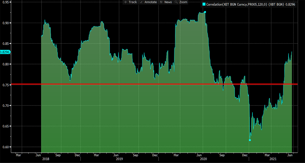
Source: Bloomberg. BTC and ETH 120 day rolling correlation since 2018.
Correlation and relative performance are completely different metrics. One ETH was worth 0.11 BTC in Jan 2018 and is now worth 0.06 BTC. Despite the hype, ETH has done half as well as BTC over the three years since the peak.
ETH priced in BTC
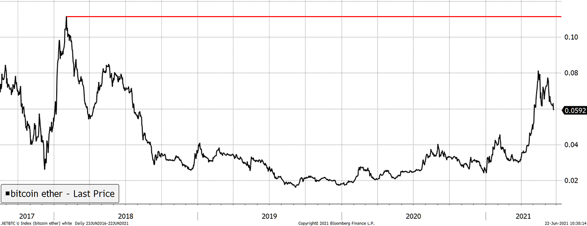
Source: Bloomberg. ETH in BTC with the 2018 high shown since 2017.
The relationship is cyclical. BTC has been a superior store of value during bear markets, while ETH has outperformed the bull markets. In 2018, ETH lost 91% of its value in contrast to BTC at -83%. It’s a huge difference.
The relative high models we run observe this relationship for the top 100 cryptos, and I’ll come back to that later. First, I want to look at the ETH network.
Like BTC, the ETH gas fees are falling sharply. Having peaked at a whopping $117,202,967 in early May, they were $3,836,998 yesterday. It doesn’t look like much on a log scale, but it’s a wipeout.
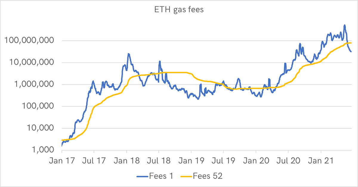
Source: CoinMetrics. Public data; ETH gas fees over 1 and 52 weeks since 2017.
Transactions have also dropped sharply and are back to levels seen last summer when the price was $350.
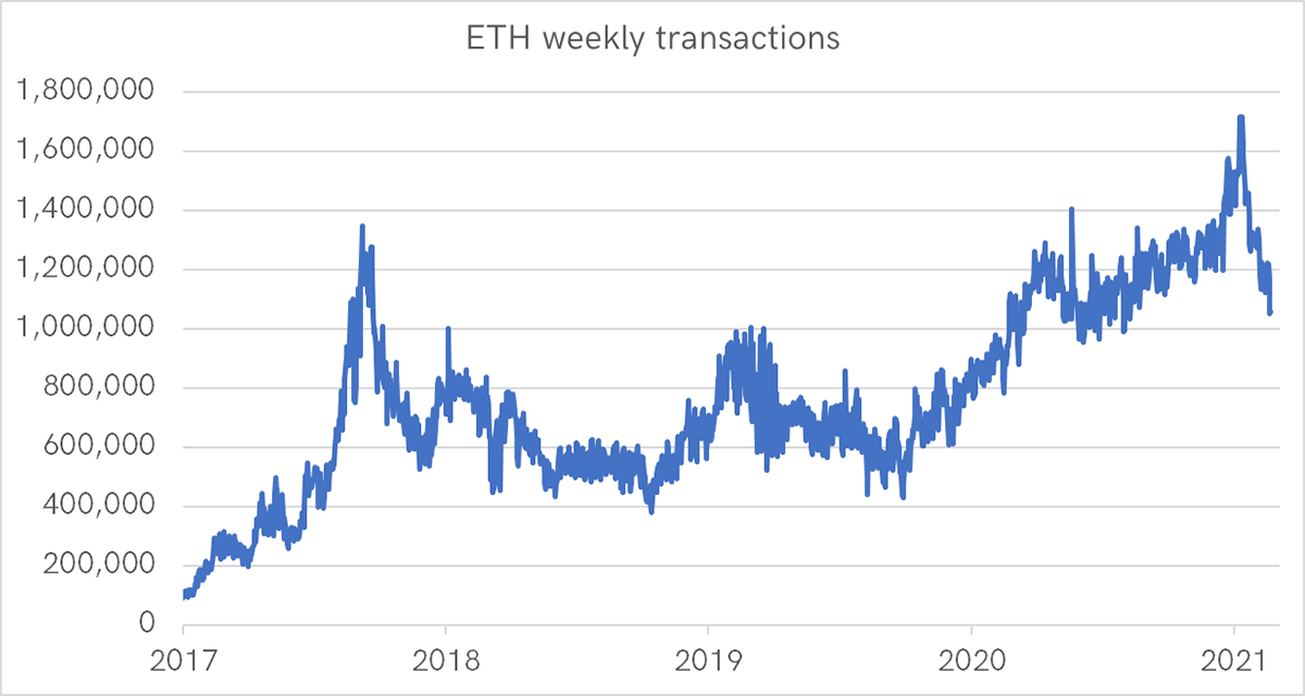
Source: CoinMetrics. Public data; ETH weekly transactions since 2017.
I have run the CoinMetrics public data for ETH through the ByteTree Network Demand model. The fair value data works surprisingly well, and ETH comes out close to fair value. But I would remind you; there tends to be a lag when things turn down. I am more focused on the trend in network activity as opposed to the level.
Ethereum network fair value
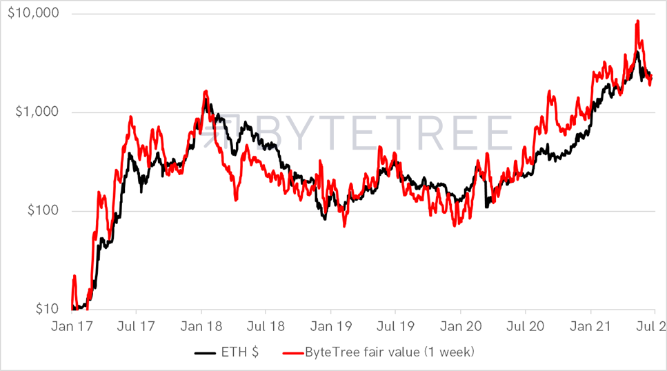
Source: ByteTree; CoinMetrics. Public data and ByteTree ETH fair value model since 2017.
The best bit is that I also ran the ETH data through our Bitcoin Network Demand model. Sadly, there was no data for “First Spend”, but I have used the other indicators; fees, transaction value and velocity. While I can’t claim this will be repeated, owning ETH using our model turned $100 into $92,323 in contrast to HODL, which made $20,374. That’s four and a half times better, with infrequent trading.
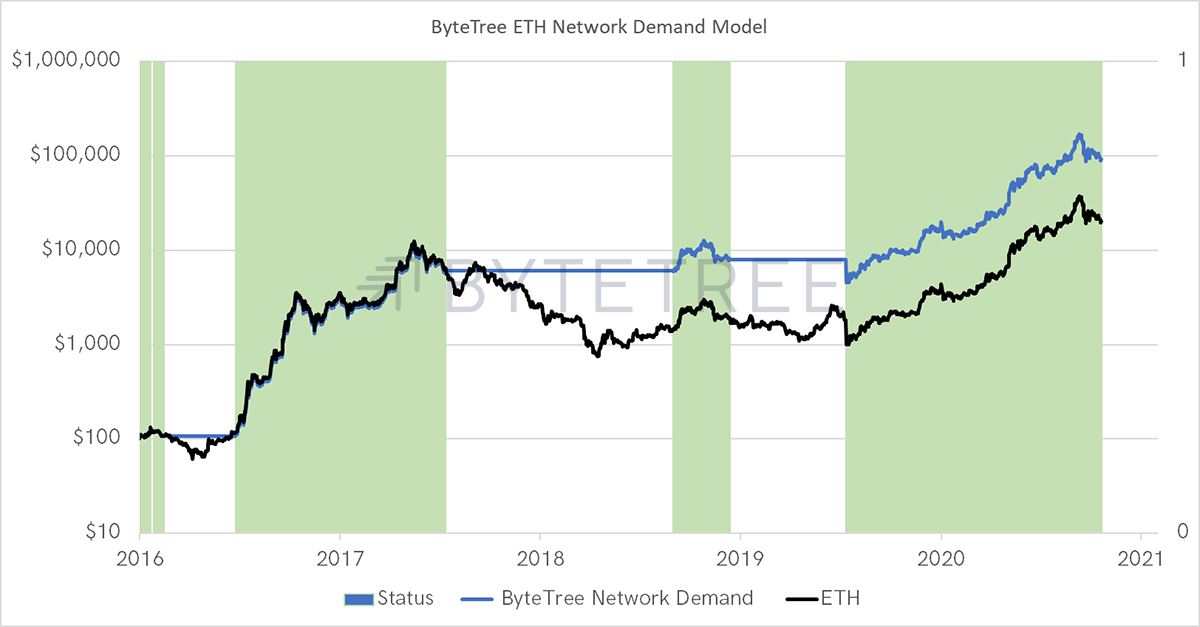
Source: ByteTree; CoinMetrics. Public data and ByteTree ETH network demand model since 2016.
When I used the signal to buy ETH using BTC data (long ETH if BTC model is ON), it got even better. I can jump straight to 2015 as I don’t need to gather data measures that year when ETH was young. Now that $100 turns into $1,570,490 in contrast to HODL of $186,890. That’s a mind-blowing difference.
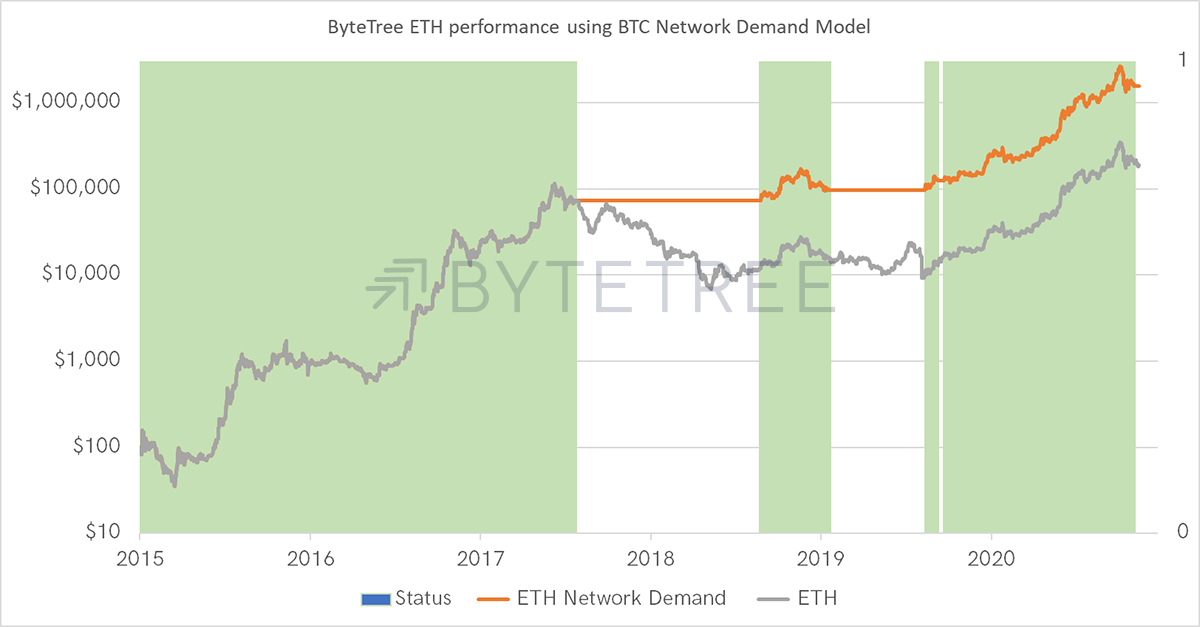
Source: ByteTree; CoinMetrics. Public data and ByteTree BTC network demand model investing in ETH since 2016.
This will not be repeated with such heroic results in the future. The law of large numbers suggests future crypto bull markets will be lesser than seen in the past. Nevertheless, I am confident that the ByteTree approach will see continued success and outperformance.
We don’t actually need ETH data to thrive. We just need to know that the coast is clear by studying BTC and trade the altcoins that show strength during such times.
BTC is the “beta” of the space (like the S&P 500 is for equities). The “alpha” (excess return) comes from stock picking. We do this both quantitatively (data) and qualitatively (research).
This is our plan, but yes, we will keep on adding new data sets.
As I wrote last week, Quant (QNT) currently stands out, but with the tide going out, better to watch and learn more about QNT than to jump straight in. When BTC finds support, we’ll flash the green light.
ByteTree ATOMIC
Technical
BTC tests the 20-day low. The dead cross (30-day moving average below the 200-day) is now clear.
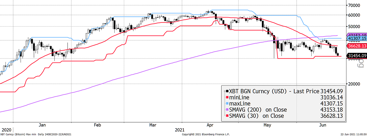
Source: Bloomberg. Bitcoin with max-min and moving averages over the past six months.
The 200-day moving average is still rising but won’t be for long unless BTC can get back above $42,000 and stay there.
This important trendline currently sits at $23,000. The good news is that it rises at 110% per year since 2013. I ignore pre-2013 data as it is too good to be true, but this line continues to be effective until proven otherwise. I would think a break below $31,000, should it happen, will see this area provide support.
Bitcoin trendline
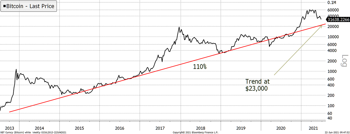
Source: Bloomberg. Bitcoin with long-term 110% trendline since 2013.
There are no guarantees BTC does break. It may bounce, but I feel it would take a piece of good news (the Pope or Warren Buffett buys Bitcoin etc.) as the current network data remains weak. This cycle appears tired, and China leaving the party is bad news.
On-chain
I want to reiterate that rising velocity demonstrates that coins move more quickly when prices are low. That’s bullish when it happens and is often seen after violent selloffs such as late 2018 and March 2020.
Velocity remains low
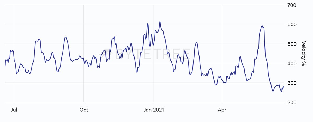
When it is absent, we have tended not to see V-shaped corrections such as March 2018 and September 2019. More velocity will be bullish.
The one thing holding back the network is the rising block interval. The miners have slowed down as the ban from China bites. The current level of difficulty is too harsh, given the level of mining hash power. The blocks should arrive every 10 minutes (600 secs), but that is rising again.
The blockchain slows
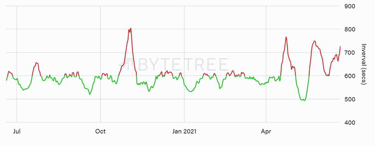
Source: ByteTree. Average blocktime over the past 52 weeks.
If you go to “raw” on ByteTree Terminal, the average block interval over the past 24 hours is shown under “Blockchain health”. The average block time was 839 seconds yesterday.
Expect a sharp downward difficulty adjustment, the third in a row. This isn’t something we would normally see during bull markets.
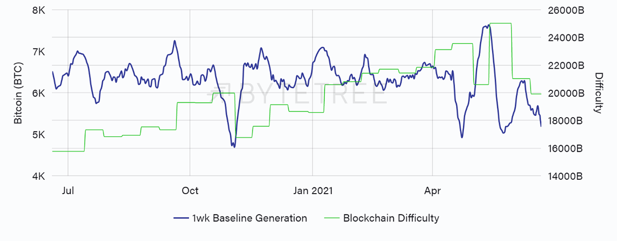
Source: ByteTree. Block generation vs blockchain difficulty over the past 52 weeks.
Macro
The US money supply growth exploded last spring, and it must have driven many people to Bitcoin. The downturn over the past two months is less talked about, but it’s a fact of life.
Falling money supply
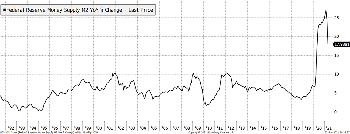
Source: Bloomberg. US M2 change YoY since 1992.
I mentioned the dollar rally last week, which is never much fun for financial markets. Another way to look at this is with the Aussie Yen. This is a classic risk-on/off FX pair, and now it is slipping along with commodity prices.
Aussie Yen rolls over
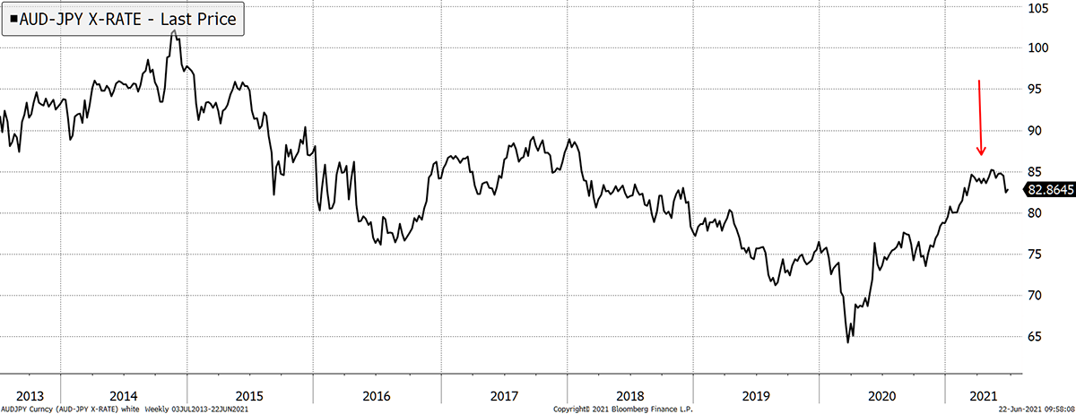
Source: Bloomberg. AUD JPY since 2013.
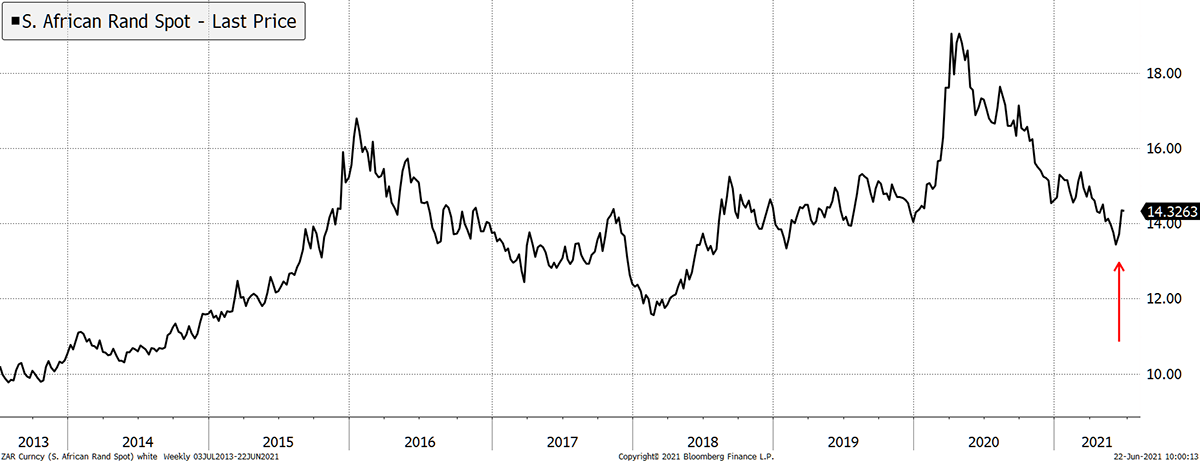
This may all prove to be short-lived, and I hope so. But even if it doesn’t, there will be opportunities if we think outside the box. Here is an example. The South African Rand has been super strong since March 2020 (fewer Rand to buy a dollar) but is now weakening.
In which case, a low for the gold price measured in Rand may turn into a high gold price. If that’s true, they’ll be a spectacular opportunity in the long-suffering SA gold mining stocks. I know it’s not crypto, but I promise to keep you entertained until better times return.
Gold in Rand may find support
Source: Bloomberg. Gold price in Rand since 2013.
SA miners are generally listed in the US, so they are easy to trade. I’ll keep an eye on this.
Investment flows
Bitcoin funds have seen modest outflows, but that’s not the whole point. The miners sell 28,000 BTC per month, although fewer with a higher block interval. Ever since the last halving in May 2020, we have seen the fund demand broadly match or exceed the miner selling. That tightened the market, so any other buying (MicroStrategy, Tesla, Ruffer etc.) saw prices surge.
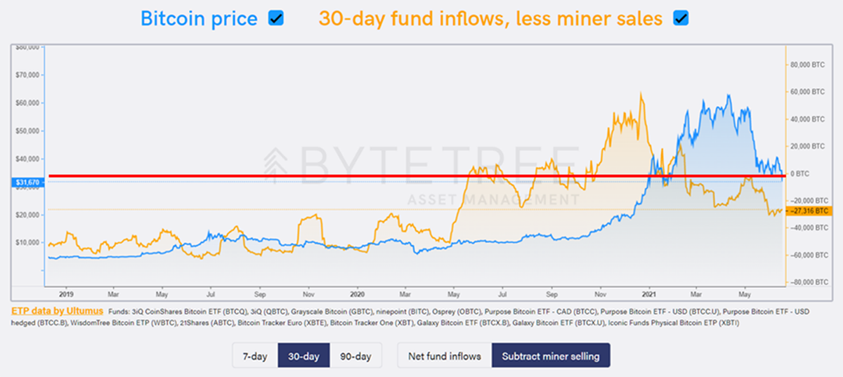
Source: ByteTree Asset Management. Bitcoin 30-day fund inflows, less miner sales, vs price.
In the chart above, I have chosen 30 days and “subtract miner selling”. The red line marks equilibrium. Notice how most of the price surge coincided with net flows above the red line. With modest outflows over the past 30 days, the BTC network is 27,000 BTC in deficit.
ETH flows will come to the site in due course. They too have surged above 4 million ETH (total supply 116.3 million ETH). There has been modest selling.
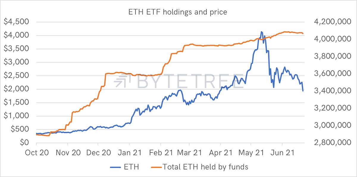
Source: ByteTree. ETH ETF flows and price since Oct 2020.
Flows aren’t everything, but when money is coming in, it sure does help. And when lots of money comes in, prices normally surge. The fund buyers will be back, but when?
Crypto
The crypto relative strength model runs behind the scenes. Currently, just three coins out of 100 are trading above their 30-day moving average. They are AMP, TFUEL and QNT.
I show a breadth chart below; this measures the number of coins trading above their 30-day moving averages. In early May, the trends turned from bull to bear. I plan to take this chart much further back so we can explore the past cycles.
Crypto breadth falls
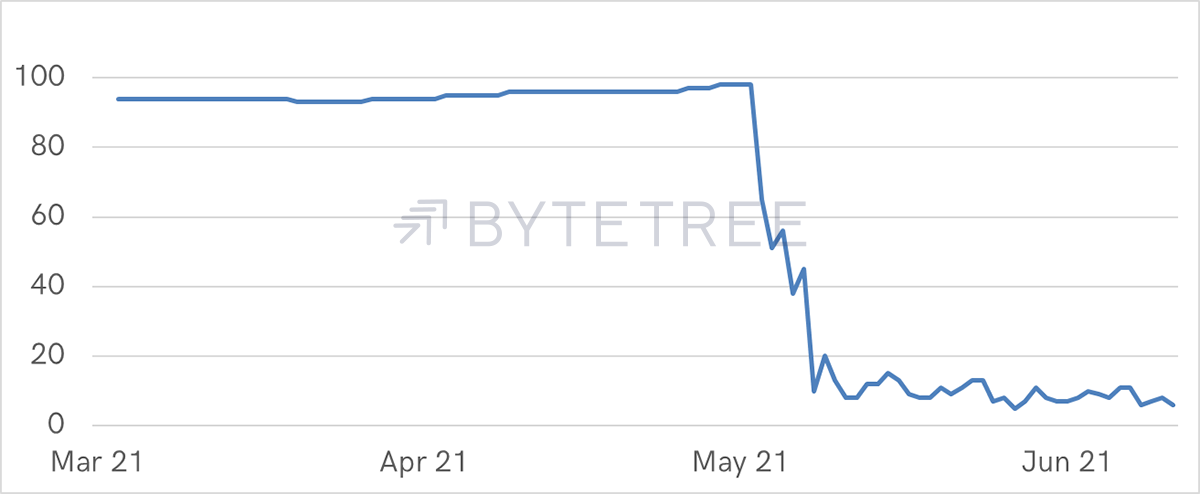
Source: ByteTree. % of top 100 altcoins > 30-day moving average since Mar 2021.
Finally, I’ll leave you with the MicroStrategy Fair Value (MSTR). The company announced the purchase of 105,085 BTC with the proceeds of the recent $500m bond issue. That was 1,000 BTC less than my estimate last week. MSTR is worth $217 per share and still trades at $570 as of yesterday’s close. A hedge like this doesn’t come around very often.
MicroStrategy Premium
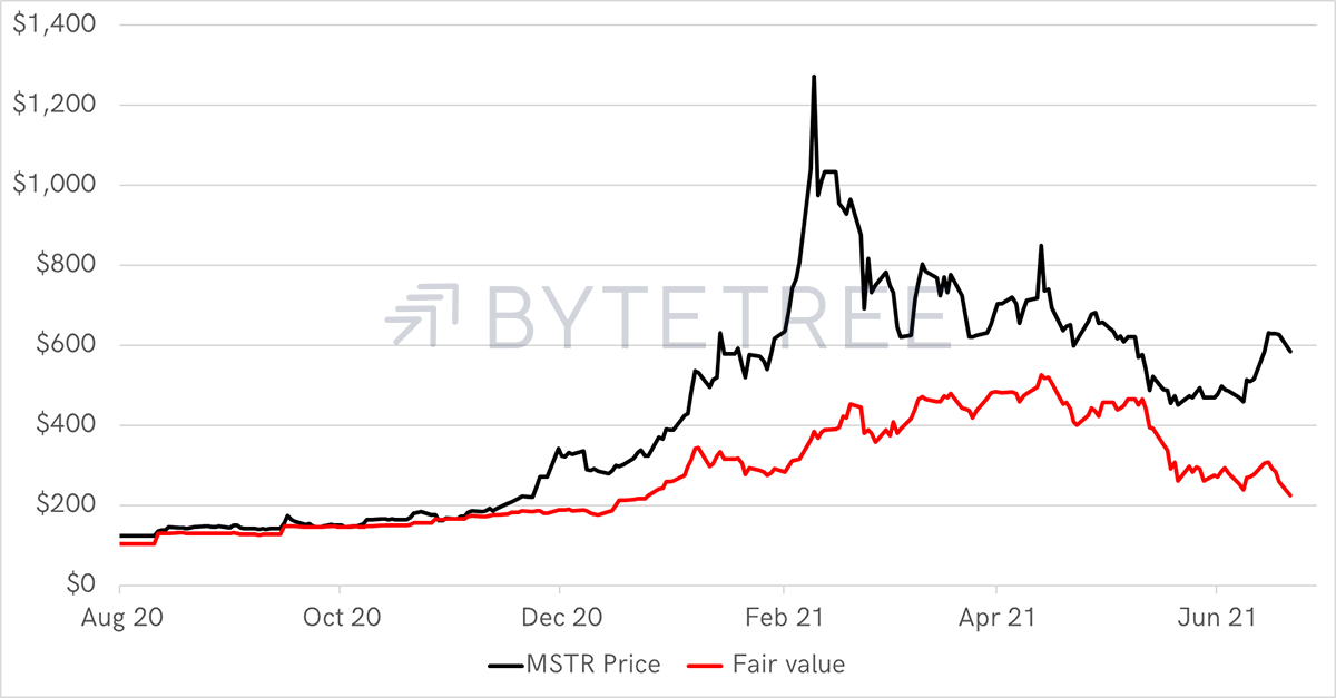
Source: ByteTree. MSTR share price and Fair Value since Aug 2020.
Disclosure - I am short MicroStrategy.

