

ATOMIC 74
It might be hard to believe, but there are a growing number of positives for the orange coin. Dollar weakness removes a headwind, while investment flows, miner behaviour and the technical picture all show patterns associated with market lows. ATOMIC remains on BULL.
ByteTree ATOMIC
Analysis of Technical, On-chain, Macro, Investment Flows and Crypto.

Highlights
| Technicals | BTC outperforms the space at the start of bull markets |
| On-chain | MRI spikes like 2019 |
| Macro | Has inflation peaked? Dollar says… maybe. |
| Investment Flows | What exchange collapse? |
| Cryptonomy | Alt weakness |
Technical
Bitcoin in US$ has started to show signs of bottoming out on ByteTrend. After a spell on zero stars following the FTX collapse, we now see a move to two stars, as the last touch was on the max line (light green), and the price is above the 42-day moving average. As has been the case for a while, there’s a long way still to go before establishing a bull trend. The long-term moving average continues to fall and now sits at around US$26,000.
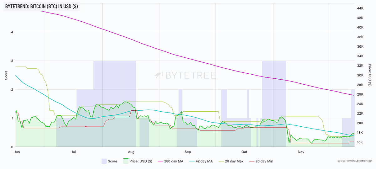
Source: ByteTree. ByteTrend for Bitcoin, in USD, over the past six months.
Despite the gloomy news, there is one thing worth watching as an indication of better times ahead.
Historically, BTC has outperformed the crypto universe at the start of a bull market. So, if we start to see the BTC price move higher but breadth in BTC moving lower, this is actually encouraging. I’ve shown this on the chart below. In April/May 2019 and then again in October 2020, breadth collapses in the foothills of a bull market.
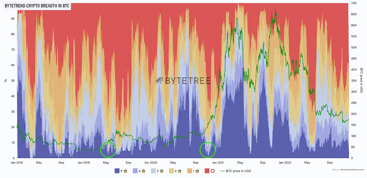
Source: ByteTree. ByteTrend breadth chart for the top 100 crypto tokens, measured in BTC and a BTC price overlay, since January 2018.
Intuitively this makes sense. At the start of a recovery, money will cautiously move into the highest-quality asset in the space. Why buy the highest risk asset when you can get the highest quality asset at a good price? It is only later in the market cycle that the more speculative laggards catch up.
Obviously, there have been false dawns on this measure, notably in May this year, but interesting nonetheless. We will be keeping a close eye on how this develops.
On-Chain
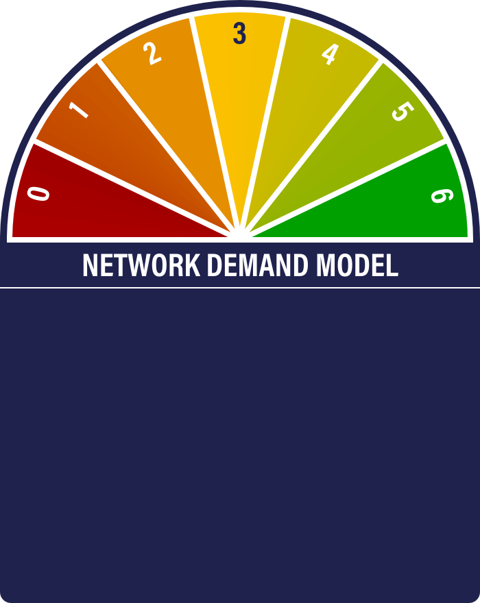
The Network Demand Model remains on 4/6, which is constructive if not outright bullish. Pleasingly, one of the two signals from both “spend” and “fees” are on, which means all categories have some representation in positive territory.


Miner’s Rolling Inventory (MRI) has popped recently, which is as it should be at the bottom of a bear market. They are experiencing distressed operating conditions (low revenue, high fixed costs) and have to offload inventory. The same pattern can be observed in 2019, as shown below.
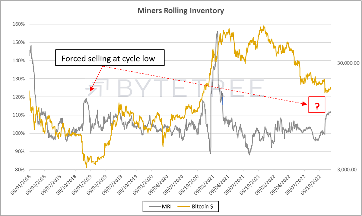
Source: ByteTree
Macro
Evidence that we’re entering a new market paradigm continues to grow. US consumer price inflation was reported earlier this week at 7.1% against 7.3% last month. The Fed has hiked their benchmark rate by 0.5% to a 4.25-4.5% target, and various commentators are making the case that inflation has peaked. The Fed appears to be wary, however, with the Chairman stating they “will stay the course until the job is done”.
The idea that the worst is behind us, and investors can pop champagne corks, is probably wishful thinking. It will take many months of good news on the inflation front before we can safely say we’re in the clear. There is plenty of risk in both directions as we go through that process - has the Fed underestimated inflationary pressures and will therefore have to tighten further? Or is it the reverse? Has it tightened too much, and will something break?
The answer is probably somewhere in the middle. Leading indicators (commodities/property markets/shipping/energy) all point to lower inflation numbers in the short term, but there are compelling arguments for a higher level of structural inflation longer term (re-shoring/lack of investment in energy/skill shortages).
It’s a very uncertain path ahead, and that spells volatility.
At the moment, the currency market is giving us the best indication of the market mood, and since the end of September, we’ve seen a substantial weakening of the US$, admittedly from what were very overbought levels. The British pound, for example, has strengthened by around 15% from its September lows (the media only reports declines, so most people will be unaware of this). The dollar is suggesting the tightening cycle is peaking.
What does this mean for BTC? BTC is happiest with easy monetary conditions. It implies an improving growth trajectory and greater appetite for risk. So, if the currency markets are correct and rates are peaking, then at least one headwind is removed.
Currency cycles tend to be long-term in nature. It may be that we are at the start of a dollar-weakening cycle. The slide below shows the dollar’s behaviour over the last 40 years. What is interesting is that weak dollar environments have been fertile ground for alternative assets.
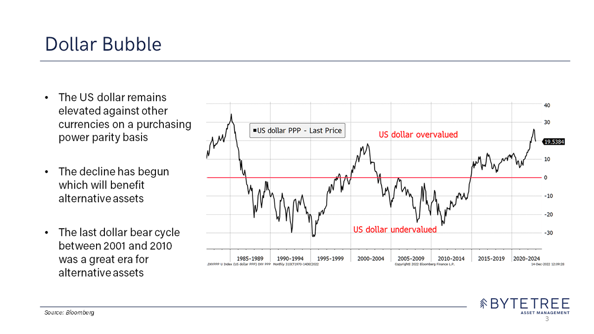
Source: ByteTree Asset Management
As you can see in this chart below (CRB RIND), the dollar bear market between 2000-2010 coincided with 10 glory years for commodities.
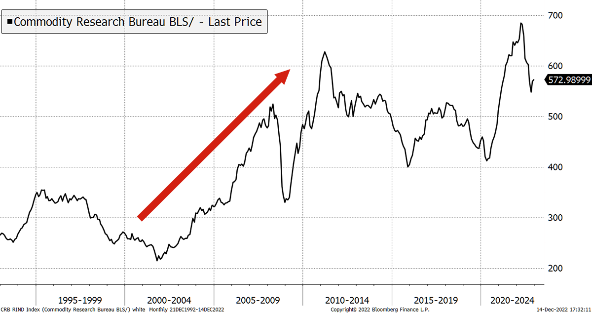
Source: Bloomberg
It was also a marvellous decade for gold, the most pristine of all alternative assets, as shown in the chart below. Back then, of course, bitcoin didn’t exist. But now it does, and next to gold is the most liquid alternative asset out there.
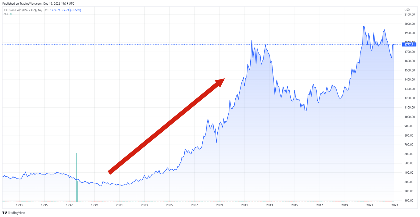
Source: TradingView
The dollar weakening of the last couple of months is the most significant shift in markets. It suggests that we are approaching a period when alternative assets will play a more important role in portfolio construction. This can only be good news for bitcoin.
Investment Flows
Unlike the August sell-off, when bitcoin flows clearly correlated with the price action, there has been no discernible movement in funds since the collapse of FTX. For those looking for evidence that most crypto tourists have jetted back home, this is it.
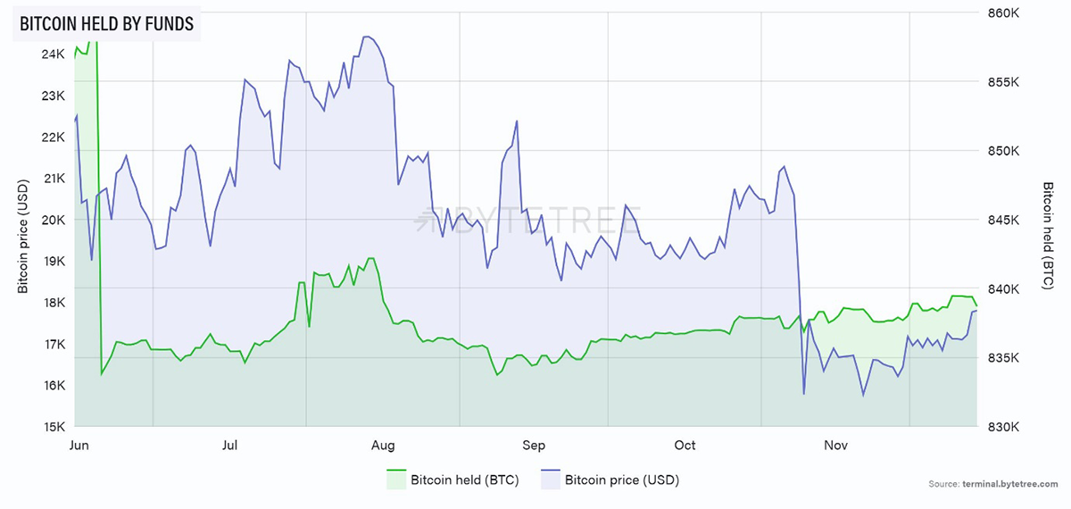
Source: ByteTree. Bitcoin (BTC) held by funds and the bitcoin price (USD) over the past six months.
ETH held in funds has been a bit weaker, but the scale of the decline is insignificant. Recent behaviour also suggests that ETH holdings lag the price, which is not what we see with BTC.
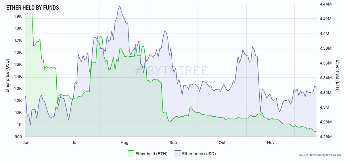
Source: ByteTree. Ether (ETH) held by funds and the ether price (USD) over the past six months.
Cryptonomy
As mentioned in the technical section, relative to BTC, there has been a recent deterioration in altcoin price performance across the board. If this is because BTC is in the early stages of a bull market, that shouldn’t bother us too much. If not, it’s not healthy. Whatever the case, it shows us that, for the time, being risk appetite is pretty low. A table showing the ByteTrend score versus BTC of the top 10 by market cap is shown below. Even Ethereum is treading water.
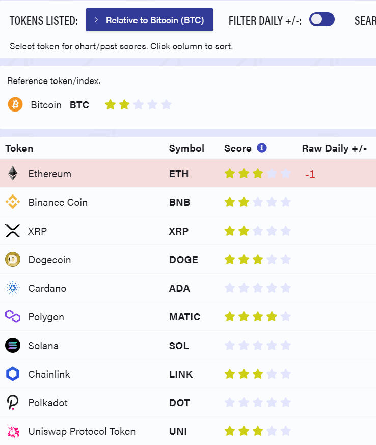
Source: ByteTree. ByteTrend scores for the top 10 crypto tokens, in BTC, sorted by market cap.
Perhaps everyone has metaphorically packed up for Christmas. Given the year we’ve had, who can blame them?
For a more detailed account of the current situation in the crypto space, please have look at this week’s ByteFolio, where we reduced one holding and added to BTC.
Summary
As we draw towards the end of what has been a grim year in the crypto world, there are undoubtedly signs that we’re through the worst. Here’s wishing for a healthy and prosperous 2023.


