Week 3 2022
Although the score remains at 1/6, behind the scenes there have been some interesting developments in the Network Demand Model this week. The short-term transaction signal briefly flickered on while MRI has perked up. The bad news is the long-term transaction indicator, the sole source of good news since early October, is on the point of turning off. As discussed last week with reference to the long-term fees indicator, the patterns we are seeing remain disconcerting.
In 2018 the long-term transaction indicator turned off around 3 months after the December 2017 crash, only to briefly turn back on again in June. A bullish trend failed to materialise, and the signal confirmed the bear market, turning off again in July. It wasn’t until April 2019 that the signal turned decisively on again.
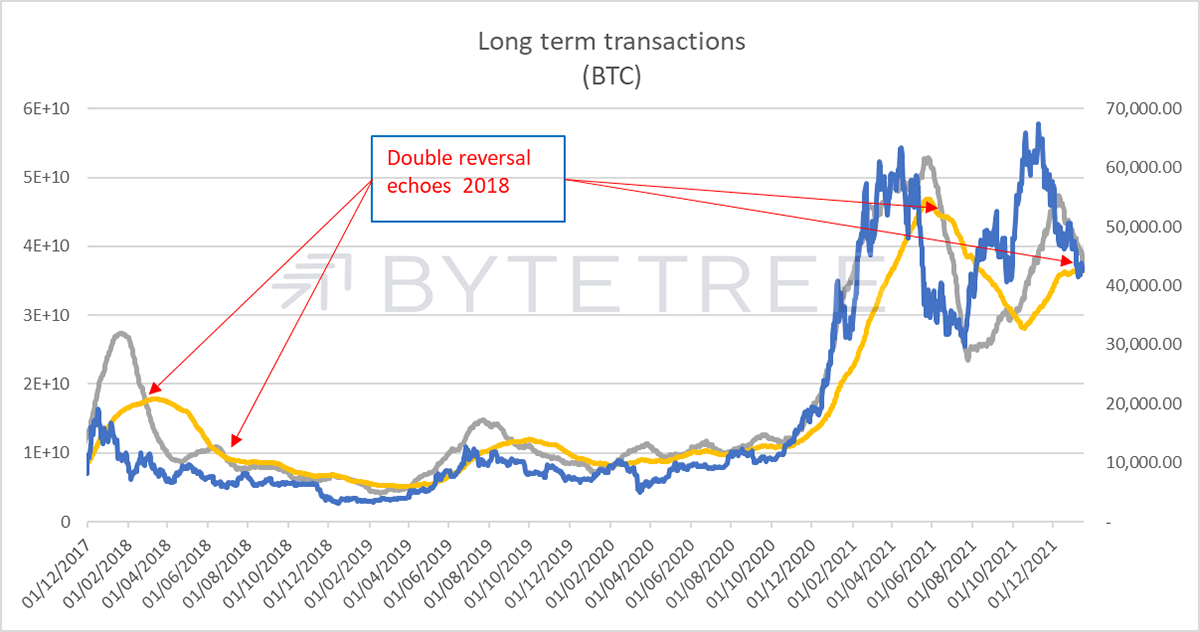
A similar pattern has developed in this cycle. The signal turned off 3 months after the April 2021 peak, was reinvigorated by the Autumn bounce, but has faded ever since. It is now on the cusp of turning off again.
This is a very long-term indicator, which is why the Network Demand Model takes an ensemble approach and mixes short- and long-term signals to properly indicate network conditions. Nonetheless, it suggests that without a meaningful catalyst, investors are at low risk of missing a big bounce.
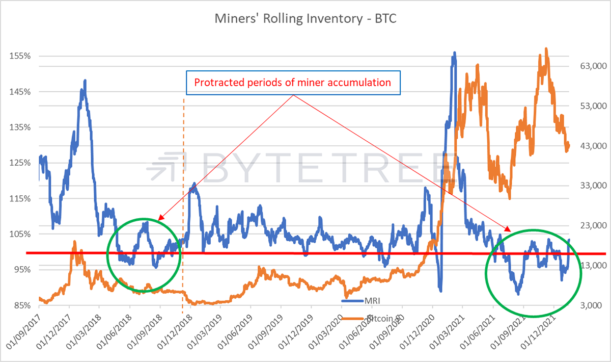
MRI has risen sharply this week, although still not enough to turn on the signal. Miner behaviour is double-edged. A steady period of selling more than they mine (where the blue line is above the red line in the chart below) tends to signal a healthy bull market. However, a spike in MRI suggests that we are reaching a buying climax.
Similarly brief periods of miner accumulation may suggest tactical buying opportunities, but protracted periods are more worrisome. The last time MRI spent meaningful time below 100% was in early 2018, when presumably there was a feeling that the worst of the price fall had passed. That, of course, proved to be premature, and the market slumped in September (dotted line on the chart below), forcing miners to release inventory at a price where genuine long-time buying was prepared to step in. We can only hope that the pattern doesn’t repeat.
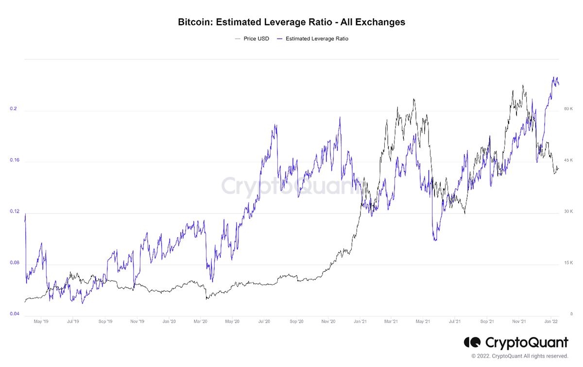
Hard as we might try, it’s difficult to find much to like in the on-chain data. It’s possible, of course, that the model is missing vibrant activity off-chain, or that this period of calm is precisely the moment to accumulate, ahead of an inevitable pick-up in activity. Without a functioning crystal ball, we can’t answer the second point – we aim to pick up the long-term trend, not anticipate it. Meanwhile, off-chain activity is difficult to accurately capture. What we can say is that a lot of exchange activity seems to be manifesting in yet another build-up of leverage. In a rare departure, here is a chart from CryptoQuant showing the levels of leverage on exchanges (defined as “open interest divided by their coins reserve”). Hardly a source of comfort.