
Visualising Bitcoin’s Economic Output Part I
This is the first part of a trilogy about visualising bitcoin’s economic output. In this article we give a brief overview of Bitcoin’s economy, introduce the transaction value heat maps and explain how you can interpret them.
The Bitcoin Network was conceived in 2008 as a peer to peer electronic cash system. Now, over a decade later, the network has reached as many as 1 million active addresses in a day and transfers between $14-$40Bn of value each week. The Bitcoin Network is undoubtedly a success. Bitcoin has triggered the largest monetary shift in generations, paving the way for digitally native currency across the world.
A brief look at bitcoin’s transaction volumes
The total volume of transaction activity taking place over the Bitcoin Network has grown from an average of $600k in 2011 to over $2.2Bn per day in 2018. The chart below outlines the increasing value transferred over the network since 2011.
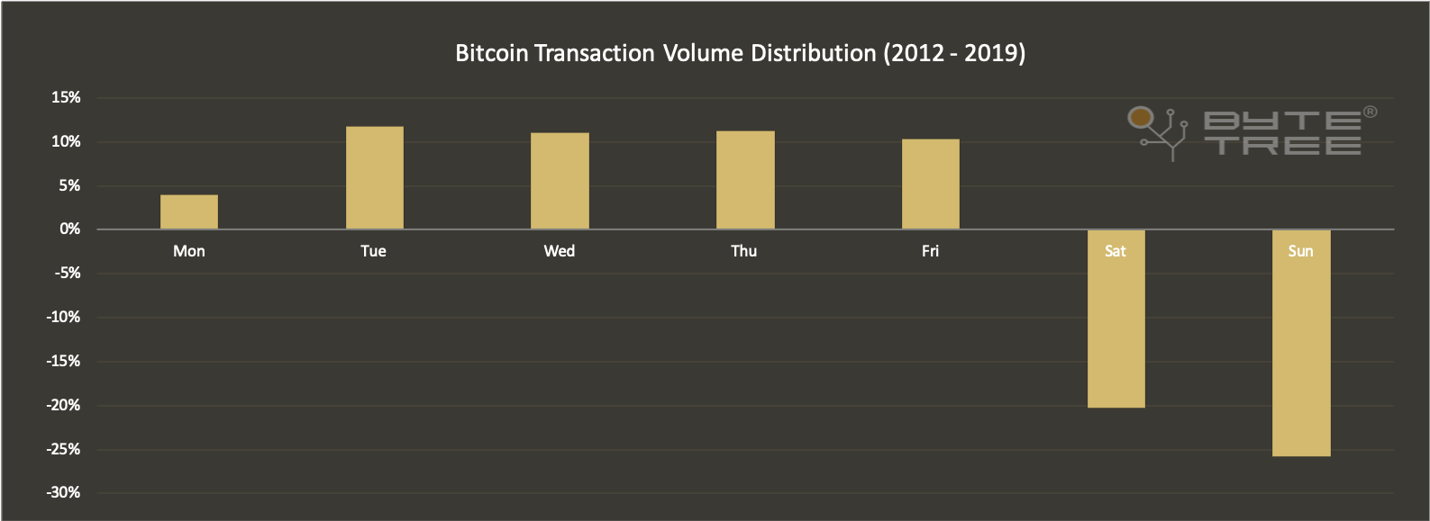
The value exchanged over the bitcoin network has become so significant that for all intents and purposes it is now a fully-fledged digital economy. As example of how Bitcoin behaves like any other real-world economy is the way that economic output (AKA gross domestic product or GDP) drops at weekends, despite the networks availability to support settlements 365 days of the year. This weekday bias can be viewed on the chart below;
Who or what are the drivers of Bitcoin’s transaction volume?
Now we have established that the Bitcoin Network represents a digital economy, we want to approach the question of who the actors are within this economy. The pseudonymous nature of bitcoin’s accounting structure makes it notoriously difficult to know the who and why behind transactions. To add to that, at ByteTree we are not even interested in snooping on individual wallets, that is not our ethos. Rather than identify whether an individual wallet belongs to a Russian Oligarch or drug cartel, we identify them as “Whales” or “Vendors” respectively. We want to bring greater transparency to the types of actors contributing to Bitcoin’s transaction volume, rather than the identities of them. By breaking down the types of actors exchanging value over Bitcoin, we hope to improve our visibility on what can be considered real economic activity versus fake traffic of spam. What’s more, we can then compare the economic activity of the Bitcoin Network with the likes of other payment networks such as Bitcoin Cash (BCH) and Litecoin (LTC).
Bringing transparency to network activity on the Bitcoin Network
To better understand the types of actors exchanging value over Bitcoin we have just released our latest and greatest feature, the transaction value heat maps (tx heat maps). The tx value heat maps enable users to visualise the composition of network traffic in real time.
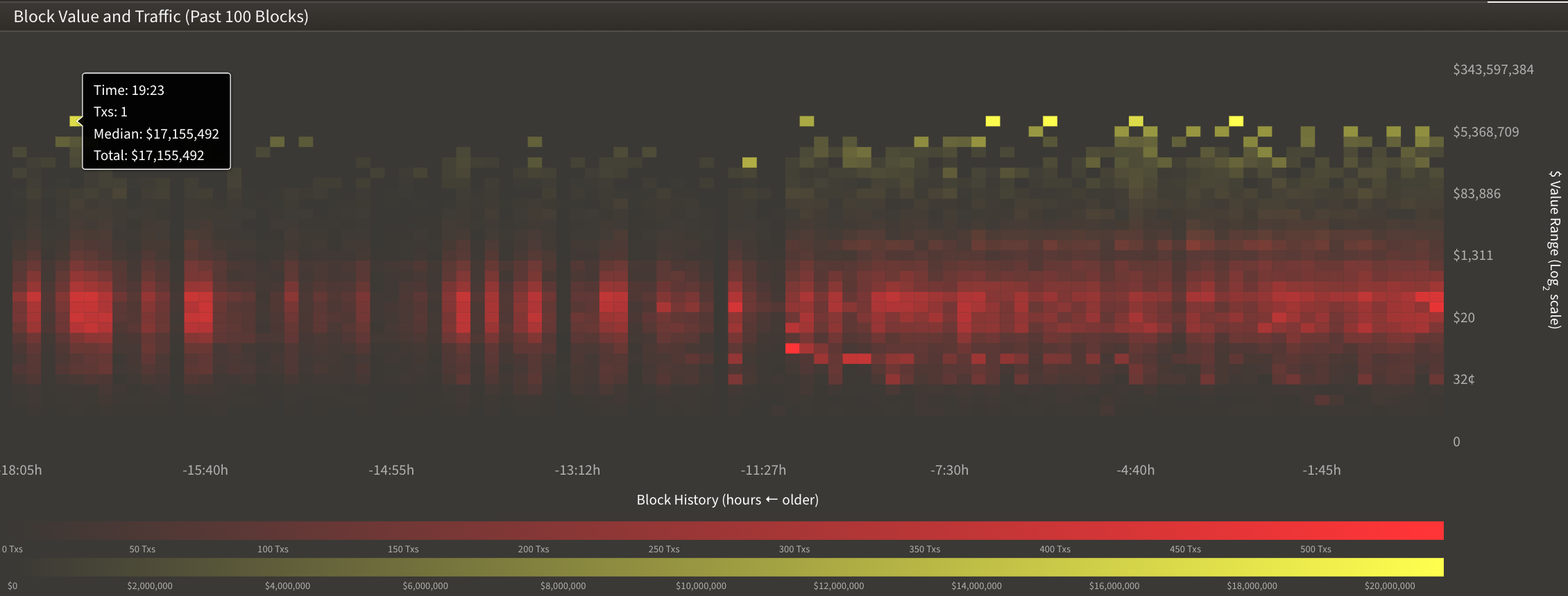
On the heat map above you are looking at the last 100 blocks of activity (x-axis) versus the value ranges in dollars (y-axis). Each column represents one block and each block has around 3k transactions in it, meaning each column contains information on around 3k transactions. The rows represent different “value bins” and the value bins double as you move up the axis. As an example, we have value bins for $1-$2, $2-$4, $4-$8 and so on. The colour scale is used to visually represent the volume of transactions within each value bin. The redder a square is, the more transactions in it. The yellower a block is, the higher the dollar value of that square. Bright red and bright yellow together (bright brown) would signify a high density of high value transactions.
Summary
You can explore the transaction value heatmaps for each blockchain that we track LIVE on the ByteTree Terminal. To view them, simply click on the blockchain you want to explore and select “value heat map” from the secondary view. The heat map updates each time a new block is added to the chain. If you’d like to explore a wider time range for this data, please contact us at info@bytetree.com.
In the second part of this trilogy on bitcoin’s economic output we will discuss the different types of economic actors using the network.


